It all started from the beginning of 2019. It was a gloomy day at the office as I was struggling to get ESLint and Prettier to work nicely with React and Typescript. After battling with it for a couple of hours, I’ve decided to write an article about it.
Time moved on and I’ve written a couple more (even though neither of them got the traction of the first, beginners luck I guess). I’ve started to really like the concept of writing articles. I’ve started getting more into the world of publishing technological articles. A lot of buzzwords were thrown in the air - cross-posting, search engine optimization, canonical links and more. I’ve noticed that most of the serious people who post articles have a blog of their own from which they share (or cross-post, as the lingo goes) to other platforms.
I was thinking to myself - Why shouldn’t I have one? You could say it’s not really worth the hassle, as I don’t have a clear vision as to how many articles I plan to write, and I certainly don’t have the time to write every week or so, but I thought it would be a fun project, and I hoped to learn something from it.
I have a decent experience with web development, mostly in React and I was thinking I could make a use of it in my blog. Around that time I stumbled upon this post, where the author suggested using Gatsby.js for such things. I’ve never worked with Gatsby before, and most of my experience in web development comes from the component age (quite a noob, I know), but after a quick look through the documentation (which is superb!) I figured it would be a perfect solution for my blog.
Let’s Build a Blog
I’m not going to explain every little implementation details (this is not a Gatsby tutorial) - mostly because I feel everything I can write wouldn’t be as clear as the official docs.
I started by going through Gatsby’s step-by-step tutorial. And after getting a good-enough grip on the matter, I’ve decided to jump right in. I used a starter built for blogs by gatsby (it’s right here!), which gave me a solid skeleton to begin with. I know I could’ve made it myself, but I didn’t feel confident enough with gatsby, so I considered it a template - much like projects bootstrapped with Create React App and I know there is a big debate over whether these starters are the best way to go, but this is not the scope of this post.
Generating a Base Line
First things first, I’ve removed some bloat I didn’t need and replaced it with my own articles and profile pic. The next thing I did was format my posts. Now that I was using a starter (which relies on good markdown practices), I’ve found out that my articles were not up-to-snuff - for example - missing subtitle, description et cetera. The whole point of frontmatter was new to me - Medium and dev.to do a great deal in helping you avoid that.
Another thing I added was a reading time measure (Don’t you just love to see an estimate to how long it would take you to read a post?).
Ready to push and deploy
Just kidding, obviously it was not done yet (for my likes, other people might find it satisfactory at this stage), but it really took little effort on my side to make it very functional with my own data.
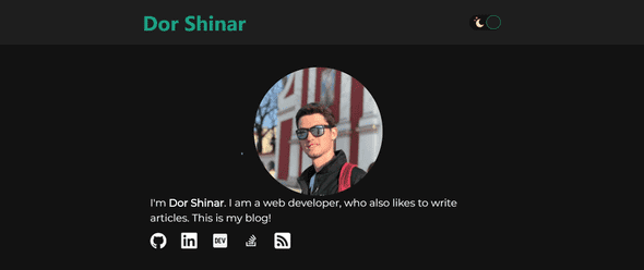
A few more minor modifications took place - I added links to my GitHub and Linkedin profiles (a few more were added later). I’ve also started writing this very article, as I wanted it to be written more as a blog post describing the process rather than a technical article about setting up a gatsby site.
I’ve converted all the inline CSS to Styled Components, as I simply love the way SC enables you to write semantic HTML in a way that suites each and every component in your code. ESLint + Prettier + Husky + Lint Staged were a welcome addition as well at this stage, as it drove me nuts to manually fix code and style errors. A custom scroll indicator and shorter post URIs (or slugs) were the last addition at this stage.
CSS Tweaks FTW
My journey continued with A LOT of small tweaks, mostly around CSS and visibility - using a google font, line breaks between posts, and extracting the Header to a new component. Nothing big, but those tweaks helped me down the line, and made the site look slightly better.
I’m a huge fan of dark mode. My agenda is “Dark Mode ALL THE THINGS!”, so naturally I couldn’t let my website sit idly by with only white background. I started implementing a theme switcher (using Context and styled-components’ ThemeProvider). At the beginning it was a simple button to switch black and white background, and as I got is up an running I created a full color scheme for my website, both for a light theme and a dark theme. (Shout out to Google’s Material Design Dark Theme Documentation). All my referral icons had to be converted based on the theme, so that happened as well, and my theme was nearly complete (it has undergone some small hue tweaks later but whatever).
Fitting my website to look best on mobile was the next step - as I am used to develop enterprise apps mostly for desktops, it slipped my mind that most traffic today comes from mobile. From the W3C’s Responsive Web Design - Media Queries tutorial
Always Design for Mobile First
So I failed in that until now, but I was eager to change that. Using Google Chrome’s awesome developer tools is was really easy to simulate a bunch of different devices at different sizes and resolutions, so more CSS tweaks took place.
In an effort to make the site ready for going live, I’ve added a link to the RSS feed, that was generated (the starter I am using took care of that).
Deploy Like You Just Don’t Care
Now I really felt confident I could upload it to the cloud for the world to see. Knowing there will be no traffic at the beginning, I knew I can experiment after setting it up, so I left some things for later. The cloud provider I chose was Now, as I saw a post on dev.to where quite a lot of people recommended it, so I figured I’d take a look at their offers. My blog is strictly a hobby, and I don’t plan on monetizing it, so I was looking for something with a free tier that would fit my needs, and after comparing the offerings of Netlify and Now, I’ve decided to go with Now.
Setting it up with my Github account was super easy, and everything just worked, as I expected. I bought a domain and registered it there, and I’m off to the races.
Now.sh integrates really well into Github, so it redeploys on every push, saving me a few clicks, and the overall UI feels very intuitive, allowing me to get up and running in less that an hour.
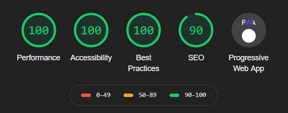
The last few things I had to do were setting up analytics (first time for me as well), adjust links to point to my flashy new domain and fix some small a11y stuff (I don’t want to keep anyone from reading my blog), allowing me to get awesome scores in lighthouse tests (YAY!).
Now my site is up and running, and all that is left is make sure it appears in search results (canonical URLs and all that), and marvel on almost 2 months of work. It sounds like a lot but I only had a few hours here and there to actually work on it. If I was doing it full time it probably would have taken 2-3 week, or even less.
For me it was a real learning experience, coming from enterprise background (where we run in a closed intranet for security reasons). I got to try a bunch of cool stuff and build something that I find really awesome. Now my plan is to keep writing whenever I get the chance, so more people will be exposed to my articles.
The blog is obviously not complete. I suppose I’ll add integrated commenting mechanism sometimes soon, and a bunch of other stuff like links to editing on github, but for now I’d say it’s definitely good enough.
Thank you for reading!


